 Image credit: Forbes.com
As a company that recently rebranded, the process of branding feels fresh and familiar. Currently, some of our clients are also launching rebranded messaging and missions for 2020.
Although the results look straightforward and simple, the decisions required along the way can be overwhelming.
One area of branding that our clients have struggled with is color. For that reason, we’re taking a look at the recent announcement regarding Pantone’s 2020 Color of the Year to explore what it might offer your brand.
Does Classic Blue capture the essence of your business? Does color really matter to your brand?
Decoding a Color
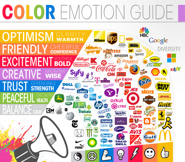 Image credit: thelogocompany.net
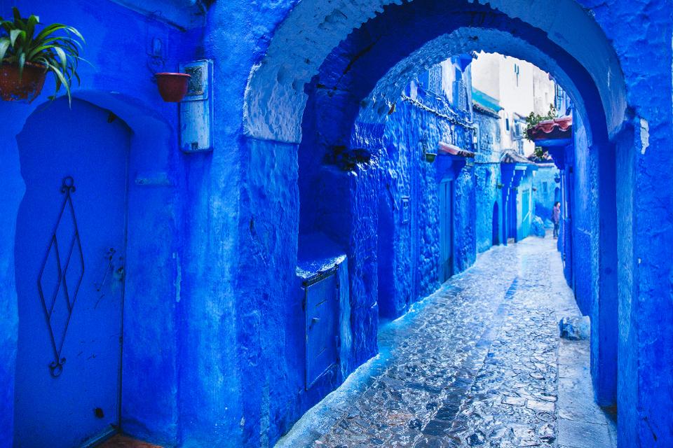
Officially announced as PANTONE 19-4052 Classic Blue, this color was chosen for “Instilling calm, confidence, and connection.”
These three qualities would arguably be valued by any business at any point in history. Pantone specifically selected the shade because “this enduring blue hue highlights our desire for a dependable and stable foundation on which to build as we cross the threshold into a new era.
Timing is everything. With 2020 barely underway, we have entered a new era, one already heralded in by turmoil, tension, and tragedy.
In other words, Classic Blue is Pantone’s antidote to the dark realities challenging the best of businesses and brands.
A Sign of the Times
 Image credit: The New York Times
American author and color theory consultant Faber Birren believed, “The story of color is almost the story of civilization. There is hardly a trace of primitive man dug from cavern or tomb that does not reveal a glint of hue.”
No wonder then that Leatrice Eiseman, executive director of Pantone’s Color Institute, explains the power of the present to influence the palette:
“When we look at the world around us, we know that we’re living with a lot of unrest, where some days we don’t feel quite as secure. Blue, from an emotional, psychological standpoint, has always represented a certain amount of calm and dependability. It’s a color that you can rely on.”
A Color Claimed by Countless Industries
There is no shortage of brands based in blue.
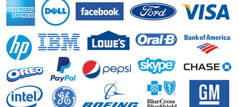 Image credit: www.logomaker.com
Pantone’s research reveals that “Classic Blue popped up in fields as diverse as the art market, the beauty industry, automotive manufacturing, tech, and even outer space.”
Perhaps because, according to Color Psychology: How Color Meanings Affect Your Brand, “In color psychology, blue’s color meaning ties closely to the sea and the sky. Stability, harmony, peace, calm and trust are just some of the feelings your customer may feel about your brand when you integrate the color blue into your branding.”
Betting Your Brand Color on the Beholder
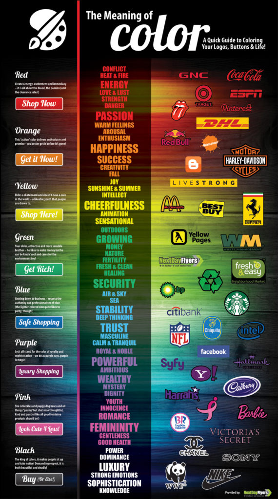 Image credit: www.nextdayflyers.com
How will your brand color be perceived by your audience? Should that perception take precedence over how you choose to present your brand?
According to When Colour Matters: Brand Identity and the Psychology of Colour, even gender influences color considerations:
Briefly, by percentage, women’s favorite colours are blue by 34 percent, purple with 23 percent, followed by green by 14 percent and red by 9 percent. The least favorite colour is white, at 1 percent.
Men’s favorite colours break down by the biggest percentage was blue at 57 percent, followed by green at 14 percent, black at 9 percent and red at 7 percent. Least favorite on this chart is yellow at 1 percent.
It looks like Pantone is onto something with blue the clear winner in both camps.
Your Brand Color is Your Business
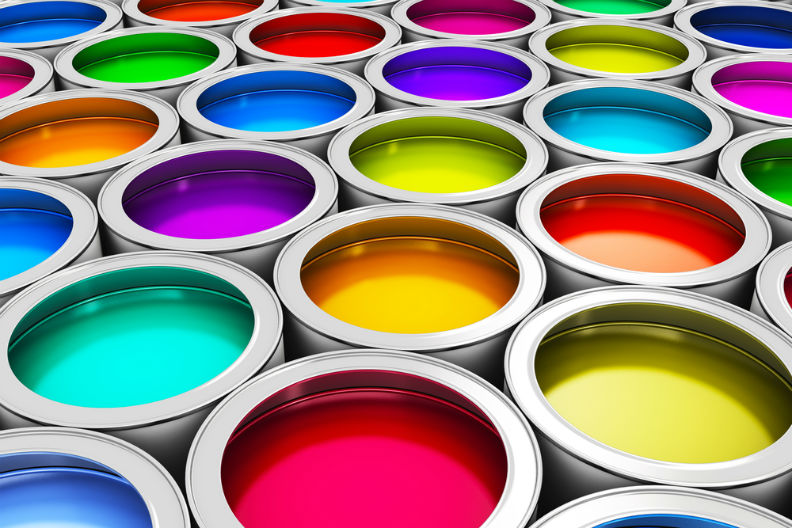 Image credit: Grosvenor Painters
Waypoint Writing’s new brand colors, primarily green, are evidently matched in appreciation at 14%, with our former color, purple, poised significantly higher at 23%.
Maybe we shouldn’t have stepped away from our reasons behind Purple Reign – Why We Rebranded with a Royal Hue and Unexpectedly Ended Up Right.
However, if you ask Forbes’ How To Use Color Psychology To Give Your Business An Edge, “Research has linked green with broader thinking and more creative thought. People generally like green. There seems to be a positive association between nature and regrowth.”
Regrowth is what we have been experiencing and so the change, ultimately, was timely and could be trusted.
No matter the color you choose for your business, when it comes to branding the most important aspect is transparency. You want the truth of what your brand represents to shine clearly, regardless of trend or moment in time.
Have you recently rebranded? Did color factor into your brand considerations? Which did you ultimately choose and why? Share your story with us!